deviant art

Deviant Login Shop  Join deviantART for FREE Take the Tour
[x]
Shop Similar Prints
This Print Not Available
Download File
ZIP, 237 KB
more ▶

More from *SilverPixiGirl

Featured in Groups:

Details

April 19, 2009
237 KB
Thumb

Statistics

Comments: 68
Favourites: 133 [who?]

Views: 7,187 (1 today)
Downloads: 140 (0 today)
[x]
:iconsilverpixigirl:
I have reached my full Geekiness! YAY! :boogie:

I give to you STAR TECH! :w00t:
based on Star Trek's LCARS Command Interface :heart:

This Journal CSS is animated, however dA made me put a static image so to see it live go here!

There are seven colors and three separate sections that you can mix and match with ease.
Have fun! I'd love to see your combination's!
Add a Comment:
 

Daily Deviation

Given 2009-05-30
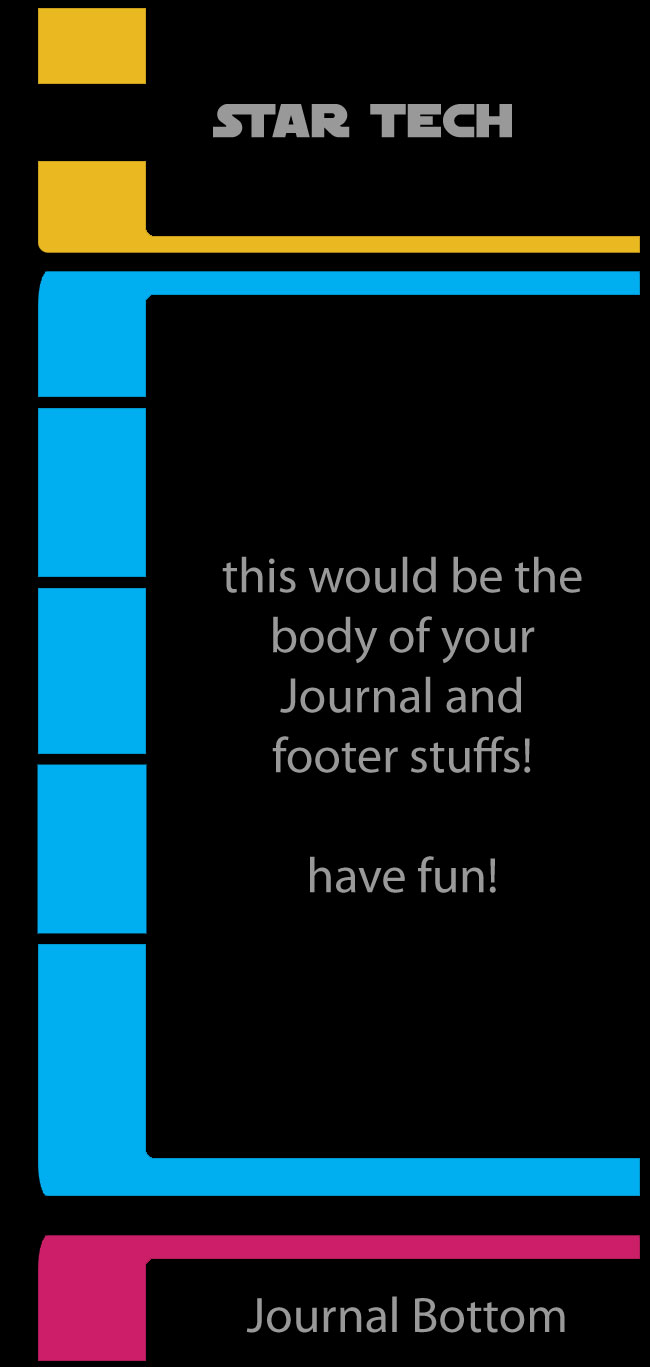
Star Tech CSS by =SilverPixiGirl The deviation itself is simple to use CSS with strong clear lines, and a great overall vision. The code is well laid out, and easy to read, and the ReadMe is simple to follow. The strength of the design is really with it's simplicity, in my opinion. It's designed with the journal text in mind, as opposed to the focus being on the design. ( Suggested by `timmy64 and Featured by `2dazed )
:icontimmy64:
First, I'd like to say that the best aspect of this CSS for me is the simple, clean layout, and the simple, clean code. I can read through your CSS and know exactly what everything does. The divs are also nice and simple, which means a beginner can pick this one up, have a look at the readme and know what's going on and won't have to remember millions of complex divs to post a simple journal.

It's great for beginners who want to learn how to use journal CSS to make their own, and just for those who want it to look like it does in the preview picture.

The clean, bold colours help by placing emphasis on the text as opposed to the layout, and let's be honest, Star Trek is epic.
What do you think?
The Artist thought this was FAIR
41 out of 48 deviants thought this was fair.

:iconimaeko:
This is really really cool!

Such a simple yet effective layout - the clean lines make it look so professional, and the variety of bright colours really add some spice and life to it. I like how you seperate out the different sections into definite modules, in a very different way to the traditional centrally aligned boxes. Its really quirky that this is sort of skewed to one side (does that make sense? ^^; ), it definitely makes much more of an impression on first sight!

So overall, I think this is a really really attractive CSS, and I hope this receives the large amount of use and appreciation it deserves! Great work Pixi! I personally think that this is your best CSS yet! :D :+fav:
What do you think?
The Artist thought this was FAIR
33 out of 41 deviants thought this was fair.

The Artist has requested Critique on this Artwork

Please sign up or login to post a critique.

love 1 1 joy 4 4 wow 0 0 mad 0 0 sad 0 0 fear 0 0 neutral 0 0
Flagged as Spam
:iconcooldude2222:
~cooldude2222 May 31, 2009  Student Digital Artist
loved the method you used to define the different parts of the layout <3

.K
Reply
:iconagentwills:
=AgentWills May 30, 2009  Hobbyist Filmographer
great interface, if I had a subscription I'd use this :D
though the use of the star wars font intrigues me
:+fav:
Reply
:iconmoonscream:
This is great! So trying it out when I get subscribed again xD
Reply
:iconangel-ceballos:
!Angel-Ceballos May 30, 2009   Interface Designer
great style :)
Reply
:iconkungpowkitten:
I like this a lot, especially because that the side bar is animated! Very cool.
Reply
:iconsilverpixigirl:
*SilverPixiGirl May 30, 2009  Professional Interface Designer
thanks
Reply
:iconelectric-ace:
~electric-ace May 30, 2009  Hobbyist Traditional Artist
Fantastic and clever! Is it only usable for those that are subscribed? Wonderful colors and font~!
Reply
:iconsilverpixigirl:
*SilverPixiGirl May 30, 2009  Professional Interface Designer
yes you have to have a subscription in order to use CSS
Reply
Add a Comment: